The Verdict

50 synthetic personas · Indian fintech behavior data

Recommended: Variant 4with modifications

Variant 4 is the highest-converting screen in the study (44%) and the only design that meaningfully cracks the Skeptical Investor segment (25%, up from 8% in Control). The dual-CTA stack lets users self-segment into 'explore first' or 'commit now', and the sticky '₹1 Trial' button makes price impossible to miss. The recommended path is Variant 4's dual-CTA layout with the blurred trade card replaced by a real closed trade, and the outline 'Unlock FREE trade' CTA made functionally different from the ₹1 activation.

Confidence

12 of 15 persona sub-segments had their best experience in Variant 4

Dissenting

Trust Seeker preferred Variant 1 (60% conversion in that segment)

Modifications needed

Replace the blurred Live Trade card with a real closed trade showing entry, exit, days held, and rupee gain

Make the dual CTAs functionally different — let 'Unlock FREE trade' show one real trade for free, reserve ₹1 sticky CTA for full activation

Variant Screenshots

Side-by-side visual reference for each variant tested.

Control
Control screenshot

Bottom-modal popup with 'Start Trial Now' — no ₹1 anywhere on screen

Variant 1
Variant 1 screenshot

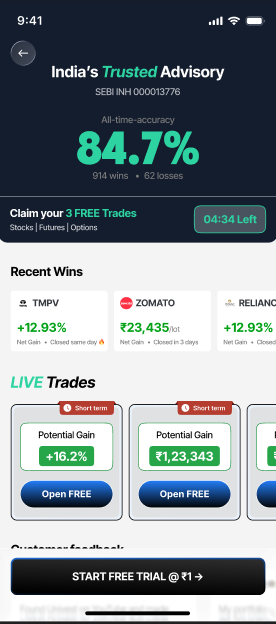
Full-screen dark theme, Recent Wins carousel, explicit ₹1 sticky CTA

Variant 2
Variant 2 screenshot

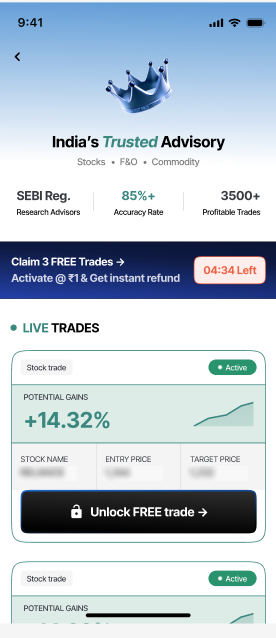
Crown header, ₹1 + refund banner, blurred trade card, low-contrast CTA

Variant 3
Variant 3 screenshot

V2 layout + green CTA — single change vs Variant 2

Variant 4
Variant 4 screenshot

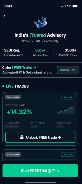
Dual CTA stack: outline 'Unlock FREE trade' + sticky green '₹1 Trial'

What Happened

Best Completion Rate

44%

Variant 4+22% vs Control

Best SUS Score

73.6

Variant 4+15.2 vs Control

Best SEQ Score

5.2

Variant 4+2.0 vs Control

02

Metrics at a Glance

Quantitative snapshot. Deltas shown vs Control. Best-in-row highlighted.

MetricControlVariant 1Variant 2Variant 3Variant 4
PRIMARYCompletion Rate

₹1 plan activation rate — the primary metric for this test

22%38%
+16
30%
+8
36%
+14
44%
+22
SUS Score

System Usability Scale (0-100). Industry avg: ~68. Higher = easier to use.

58.4
COK
68.7
BGood
+10.3
64.2
COK
+5.8
70.4
BGood
+12
73.6
BGood
+15.2
SEQ Score

Single Ease Question (1-7). Above 5 = easy. Higher = less friction.

3.24.6
+1.4
4.1
+0.9
4.9
+1.7
5.2
+2
Friction Points
32
-1
333
Avg Sentiment
-0.320.08
+0.4
-0.04
+0.3
0.18
+0.5
0.32
+0.6

03

Theme Movement

Where did themes persist, get resolved, or get introduced across variants?

ResolvedFriction from Control that one or more variants eliminated
Price opacity on the activation screen

39

of 50 users

Resolved by Variant 1Resolved by Variant 2Resolved by Variant 3Resolved by Variant 4

Control never showed ₹1 anywhere — 78% of users couldn't tell if 'Start Trial Now' was free or paid. Every subsequent variant resolved this by making the price explicit in the CTA or banner.

View details →

CTA visibility failure — low contrast and visual subordination

11

of 50 users

Resolved by Variant 3Resolved by Variant 4

Variant 2's CTA was visually subordinate to the 'Activate @ ₹1 & get instant refund' banner above it. 22% of users either missed the CTA entirely or tapped the banner mistakenly. Variant 3 fixed this by switching to a high-contrast green CTA.

View details →

Modal interrupts before value preview

31

of 50 users

Resolved by Variant 1Resolved by Variant 2Resolved by Variant 3Resolved by Variant 4

Control's bottom-modal popup slammed over a greyed-out Live Trades screen. 62% of users felt interrupted. Variants 1-4 replaced this with full-screen activation layouts.

View details →

IntroducedNew friction that didn't exist in Control
Countdown timer manipulation perception

6

of 50 users

Introduced by Variant 1

Variant 1's '04:34 Left' countdown timer converted Bargain Hunters but backfired with 41% of Skeptical Investors who read it as a high-pressure dark pattern.

View details →

Dual CTA label mismatch

5

of 50 users

Introduced by Variant 4

Variant 4's 'Unlock FREE trade' and 'Start Free Trial @ ₹1' imply two different flows but both lead to the same ₹1 activation. 33% of users noticed the discrepancy.

View details →

Green CTA softens premium positioning

4

of 50 users

Introduced by Variant 3

Variant 3's green CTA improved visibility but reduced the premium feel that Trust Seekers valued in Variant 2's darker, more understated CTA. Trust Seeker conversion dropped from 50% to 40%.

View details →

PersistentPresent in all variants — no flow redesign fixed these
Blurred trade card alienates Skeptical Investors

12

of 50 users

Across Variants 2, 3, and 4, the blurred Live Trade card is immediately recognised as a curiosity gimmick by sophisticated investors. No variant resolved this — it remains the single largest unsolved trust drag.

View details →

Abstract metrics underperform concrete past wins

8

of 50 users

Variants 2, 3, and 4 replaced Variant 1's named recent wins (TMPV, ZOMATO, RELIANCE) with abstract metrics (85%+ Accuracy, 3500+ Trades). Curious Beginners consistently wanted at least one named stock to anchor on.

04

Screen-by-Screen Experience

How did each screen's experience differ across variants? Click to expand.

Trust / Header Section
high divergence
Proof / Trade Evidence
high divergence
Pricing Communication
high divergence
Primary CTA
high divergence

05

Persona Journeys

How representative personas experienced the same checkout across all variants.

🧐

Skeptical Investor, 35

Active F&O trader, SEBI-circular reader

n=12

Preferred: Variant 4 (25%)

Converted in exactly one variant — Variant 4 — and grudgingly. Dismissed Control's hidden price instantly ('Trial without a price means hidden charge'). In Variant 1, the SEBI number and recent wins briefly held attention but the countdown timer broke the spell. Variants 2 and 3's blurred trade card was the dealbreaker ('Show me a real trade or don't'). In Variant 4, the sticky ₹1 CTA eventually wore down resistance: 'I still don't believe the 84.7% claim, but ₹1 with a refund is essentially free. Worth ₹1 to find out.'

🤔

Curious Beginner, 26

1-2 SIPs, first-time advisory user

n=15

Preferred: Variant 4 (33%)

Struggled in Control — couldn't decode the offer and closed the modal to 'look around'. In Variant 1, ZOMATO's +₹23k was the turning point ('I bought it last year — if they nailed that, I should listen') but the information overload pushed many out. Variants 2 and 3 were calmer but the missing concrete wins left them unanchored. In Variant 4, the persistent ₹1 sticky CTA finally removed pricing anxiety, though some experienced mild choice paralysis with the dual buttons.

💰

Bargain Hunter, 29

Tries any ₹1 trial

n=13

Preferred: Variant 4 (69%)Avg. time on screen: 7 seconds

The most reliable converters across all variants. Tapped Control's 'Start Trial Now' within 4 seconds and cheerfully paid ₹1 when it appeared. In Variant 1, the ₹1 + timer combo produced 54% conversion in 11 seconds average. Variant 2's refund clause was their love language but the invisible CTA cost a few. Variant 3 (green CTA + refund + ₹1) hit 62%. Variant 4 reached 69% — approaching the natural ceiling. Average time on screen: 7 seconds.

🛡️

Trust Seeker, 48

Conservative, premium-seeking investor

n=10

Preferred: Variant 1 (60%)

Converted at 40% in Control thanks to the trust badges alone. In Variant 1, the SEBI number + recent wins pushed them to 60% — their peak. Variant 2's crown branding + refund clause hit 50% despite the CTA visibility issue. Variant 3's green CTA dropped them to 40% — the green felt 'less premium'. Variant 4 restored the balance: the outline button kept the premium tone while the sticky ₹1 CTA gave pricing confidence. 'Best of both worlds — looks premium and tells me the price.'

06

Segment Verdicts

Which variant won for each user segment, and why.

Segment × Variant Conversion Matrix

SegmentControlVariant 1Variant 2Variant 3Variant 4Winner
Skeptical Investorn=128%17%8%17%25%Variant 4
Curious Beginnern=157%27%20%27%33%Variant 4
Bargain Huntern=1338%54%46%62%69%Variant 4
Trust Seekern=1040%60%50%40%50%Variant 1
7%
69%
SegmentnWinnerKey insight
Skeptical Investor12Variant 4
Best conversion in Variant 4 (25%) — triple Control (8%).View details →
Curious Beginner15Variant 4
Conversion rose from 7% (Control) to 33% (Variant 4).View details →
Bargain Hunter13Variant 4
Highest single-segment conversion in the entire study: 69% in Variant 4.View details →
Trust Seeker10Variant 1
Peak conversion was Variant 1 (60%) thanks to the prominent SEBI number and recent wins carousel.View details →

What To Do

07

Friction Provenance

Every friction point tracked across all variants.

Present
Fixed
Never existed
Friction PointScreenCTL1234Status
Price opacity — no ₹1 visible on screenActivation CTAResolved by 1, 2, 3, 4
Modal interrupts before value previewActivation ModalResolved by 1, 2, 3, 4
Payment screen ₹1 surprise (expectation violation)PaymentResolved by 1, 2, 3, 4
CTA visibility failure — visually subordinate to bannerPrimary CTAIn 2, fixed by 3, 4
Blurred trade card — trust gimmick perceptionTrade EvidencePersistent
Abstract metrics without concrete past winsHeaderPersistent
Countdown timer manipulation perceptionHeaderNew in 1
Cognitive overload — too many content blocksFull ScreenNew in 1
Dual CTA label mismatch — both lead to same ₹1 flowCTA StackNew in 4
Green CTA softens premium positioning for Trust SeekersPrimary CTANew in 3

Design Recommendations

Unified recommendations across all variants, ranked by RICE score.

HighVariant 4RICE 91

Ship Variant 4's dual-CTA stack with sticky ₹1 bottom button

Highest overall conversion (44%), best SUS score (73.6, Grade B), and the only variant that meaningfully cracks Skeptical Investors (25%). The sticky CTA is the highest-leverage element added in the study.

EffortShip as-is — no engineering work beyond deployment
MeasureMonitor activation rate for 2 weeks; target: 40%+ sustained. Track 7-day retention separately for Bargain Hunters.
HighAll variantsRICE 86

Replace the blurred Live Trade card with a real closed trade showing entry, exit, days held, and rupee gain

The blurred card is the single largest unsolved friction point across V2/V3/V4. Skeptical Investors immediately recognise it as a gimmick and disengage. Replacing it with a real trade would push Skeptical Investor conversion from 25% to 35%+ and overall conversion from 44% to 48-50%.

Effort1-2 days, requires API integration to pull real closed-trade data
MeasureSkeptical Investor conversion rises from 25% to 35%+. Overall conversion rises from 44% to 48-50%.
HighAll variantsRICE 78

Add one named concrete recent win (e.g., 'ZOMATO +₹23,435 in 3 days') above the trade card

Variant 1's Recent Wins were the most persuasive element in the study (71% cited a stock by name). V2-V4 stripped these out for cleaner design. Adding even one back would increase Curious Beginner conversion by 5-10 points.

Effort< 1 day, frontend-only — add one static card above trade section
MeasureCurious Beginner conversion rises from 33% to 40%+. 'Named stock recall' in post-test increases by 20pts.
MediumVariant 4RICE 65

Make the dual CTAs functionally different — let 'Unlock FREE trade' show one real trade for free

33% of users noticed that both CTAs lead to the same ₹1 flow and read it as mildly deceptive. Making 'Unlock FREE trade' genuinely free would increase Curious Beginner conversion from 33% to 42%+.

Effort1-2 weeks, requires backend route for free trade preview flow
MeasureDual-CTA label-mismatch complaints drop to <5%. Curious Beginner conversion rises from 33% to 42%+.
MediumAll variantsRICE 60

Add a refund SLA ('Refund within 60s to source. No questions asked.') to the activation banner

The 'instant refund' clause is the strongest pricing reassurance in the study (64% cited it). But Skeptical Investors questioned the timing. An explicit SLA would close the remaining refund-disbelief gap.

Effort< 1 day, copy change only
MeasureRefund-disbelief codes in qualitative drop by half. Skeptical Investor conversion rises by 3-5pts.
MediumVariant 3, Variant 4RICE 55

Use a dark-green or teal CTA colour instead of bright green to preserve premium positioning

Trust Seekers dropped from 50% (V2 understated CTA) to 40% (V3 bright green CTA). A dark-green or teal would maintain visibility while restoring the premium tone that Trust Seekers value.

Effort< 1 day, CSS change only
MeasureTrust Seeker conversion recovers from 50% to 55%+. 'Premium feel' sentiment scores rise by 0.1+.

What to Test Next

The concrete next experiment based on this study's findings.

Variant 4 + Real Closed Trade (V5)Predicted: 48-52%+4-8 percentage points over V4

Replacing the blurred Live Trade card in Variant 4 with one fully visible recently-closed trade (showing entry, exit, days held, rupee gain) will lift conversion from 44% to ~50% by recovering Skeptical Investors and Curious Beginners.

Effort

1-2 days (replace blur with a real card backed by API)

Risks to Monitor Post-Ship

Watch the 'tapped Unlock FREE trade then dropped at ₹1' sub-funnel — if real users react more strongly to the label honesty issue, conversion may dip 2-3 points

Bargain Hunter conversion at 69% may indicate trial-cancellation downstream — track 7-day retention separately

Skeptical Investor segment is still a 25% conversion ceiling until the blurred card is replaced